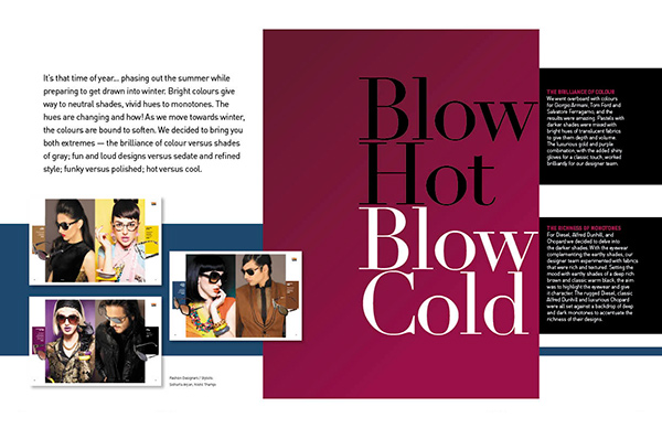
It’s that time of year… phasing out the summer while preparing to get drawn into winter. Bright colours give way to neutral shades, vivid hues to monotones. The hues are changing and how! As we move towards winter, the colours are bound to soften. We decided to bring you both extremes — the brilliance of colour versus shades of gray; fun and loud designs versus sedate and refined style; funky versus polished; hot versus cool.

The Brilliance of Colour
We went overboard with colours for Giorgio Armani, Tom Ford and Salvatore Ferragamo, and the results were amazing. Pastels with darker shades were mixed with bright hues of translucent fabrics to give them depth and volume. The luxurious gold and purple combination, with the added shiny gloves for a classic touch, worked brilliantly for our designer team.
The Richness of Monotones
For Diesel, Alfred Dunhill, and Chopard we decided to delve into the darker shades. With the eyewear complementing the earthy shades, our designer team experimented with fabrics that were rich and textured. Setting the mood with earthy shades of a deep rich brown and classic warm black, the aim was to highlight the eyewear and give it character. The rugged Diesel, classic Alfred Dunhill and luxurious Chopard were all set against a backdrop of deep and dark monotones to accentuate the richness of their designs.